

Sun in LeoMoon in TaurusThird Quarter
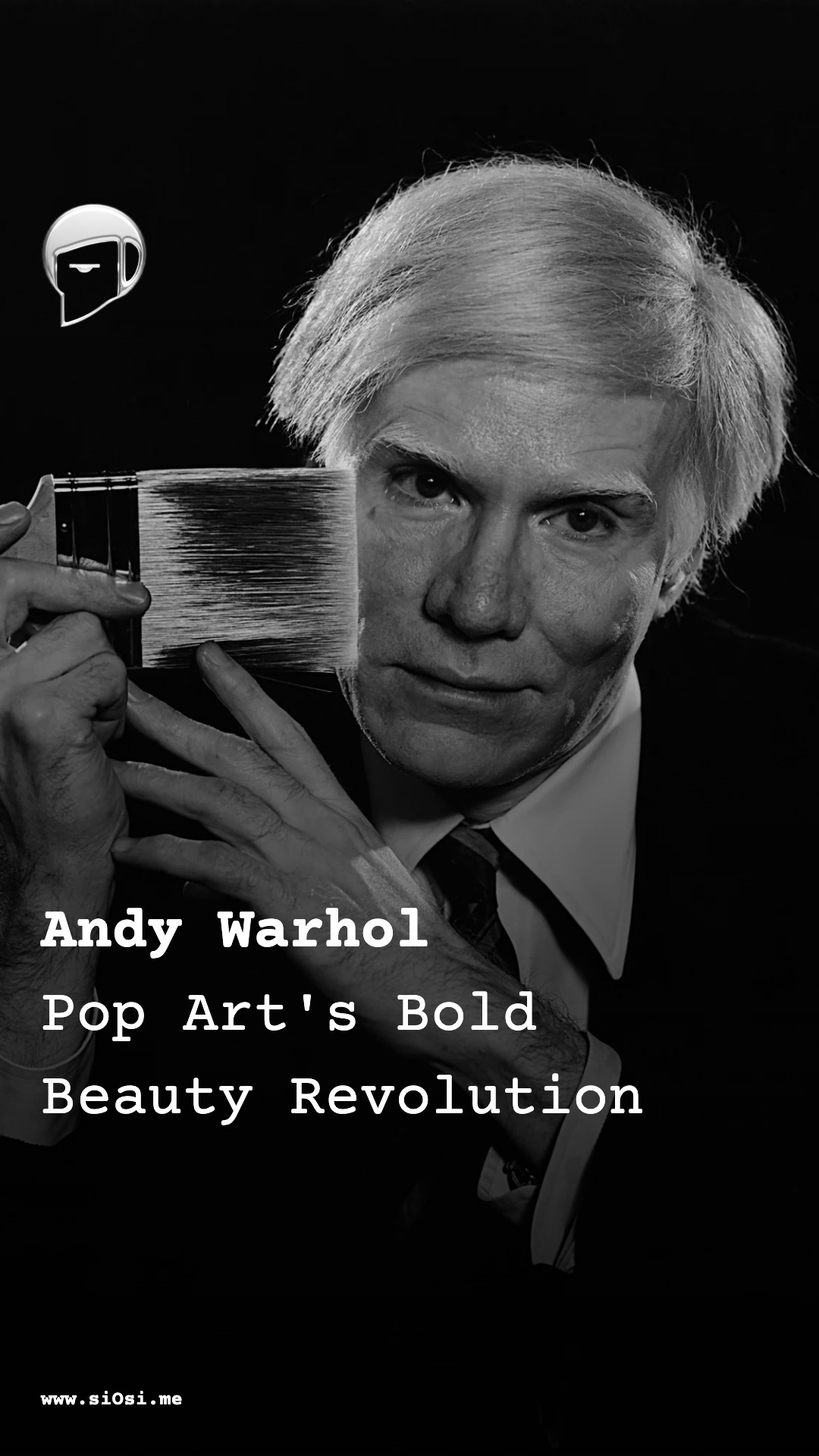
Andy Warhol Born: Pop Art's Bold Beauty Revolution
On this day in 1928, Andy Warhol arrived, reshaping beauty into something flat, repeated, and electric. His graphic silhouettes, acid-bright colors, and silkscreen textures turned faces into logos and everyday objects into couture statements. From blotted lines to serial repetition, Warhol captured the chill glow of media itself—detached gazes, permanent stage makeup, and the quiet power of overexposure. Today his vision feels prophetic: simplified features, hyper-colored impact, and the beauty of circulation that still defines our filtered, meme-driven world. Step into the surface where glamour meets the machine.
Andy Warhol’s birth in 1928 marks the arrival of an eye that would re-script beauty as something flat, repeated, electric, and disturbingly serene: a visual language in which glamour and death share the same glossy surface, and the human face becomes both icon and commodity.
Visual language: color, surface, and silhouette
Warhol’s aesthetic is defined first by surface: flat planes of color, grainy black outlines, and the stubborn refusal of painterly depth. His images—whether a face or a soup can—sit on the canvas like billboards: frontal, declarative, and eerily still. The silhouette tends to be simple, almost cut-out: the contour of a head, the oblong cylinder of a can, the blocky geometry of an electric chair. In place of nuanced modeling, Warhol gives us graphic clout: a form arrested at the moment it becomes a logo.
His color is both bright and artificial—acid yellows, dense blacks, saturated magentas, tropical greens that seem lit from within yet somehow colder than natural light. These tones often clash or sit in bold contrast: flesh rendered in blue or orange, lips in dense red against a monochrome face. The effect is cosmetic and chemical, like stage makeup under harsh lighting, or the over-inked face on a tabloid cover. Warhol’s palette does not seek harmony so much as impact; color becomes a way of staging attention, making the eye snap to a motif as it might to a neon sign.
Texture, in Warhol, oscillates between the mechanical and the fragile. His early “blotted line” illustrations create jagged, broken contours, produced by pressing paper onto wet ink to yield a blotchy duplicate. The line looks simultaneously handmade and mass-produced—delicate, skipping, as though the gesture has been run through a cheap printing press. This foreshadows the silkscreen surfaces that define his mature work: ink that pools or skips, uneven registrations that leave ghosted halos, small smudges where the screen misaligns. The resulting texture is not luxuriant; it is industrial, slightly bruised. The canvas becomes more like a misprinted poster than a reverent painting.
Movement in his images is largely absent. Warhol often chooses static motifs—a can, a mugshot, a studio portrait—and then introduces movement through repetition, not gesture. Rows and grids of the same image create a rhythm, a visual stutter: the eye walks along sequences of nearly identical faces or products, noticing tiny shifts in color or registration. This seriality mimics the motion of a production line, or the flicker of the same photograph appearing again and again in the media. The emotional movement is one of numb accumulation: a slow hypnosis through overexposure.
Light in Warhol’s work is not natural but photographic. He works from images already shaped by flash, studio lamps, and the flattening glare of reproduction: harsh highlights on hair, mascara-thick shadows under eyes, a stark contrast that bites into the facial architecture. Often, he exaggerates this contrast—deepening shadows, bleaching highlights—until the face moves toward mask or icon. The result is a beauty that feels lit by media itself, as though the illumination were the glow of television, printing ink, or the projection beam in a cinema.
The face as logo: makeup, hair, and emotional presence
Warhol’s portraits distill the human head into distinctive, basic elements: eyes, mouth, hairline, and contour, pared down to the most legible features. He simplifies facial details into bold shapes—the curve of lips, the arc of eyebrows, the sweep of hair—then suspends them in a field of color that may bear only a loose relation to flesh. Beauty, in this language, is not about realism but legibility: the ability of a face to be read instantly, at a glance, like a trademark.
Makeup becomes a graphic device. Lips are rendered as solid masses of ink, often in bright red or a discordant hue; eye sockets darken into hard shadows, lashes blur into a thick black band. Whatever the sitter’s actual cosmetics, Warhol’s process treats these zones as design units, emphasizing those features that anchor recognition. The result is a kind of permanent stage face, caught between glamour and distortion: seductive, yet slightly ominous, like advertising imagery that has absorbed too much ink.
Hair in his images is similarly stylized. It becomes a contour—short strokes or sweeping forms—holding the head in place like a halo or helmet. The line work and silkscreen grain often make hair look simultaneously sculpted and frayed, suggesting both the immaculate grooming of publicity and the degradation of repeated printing. Hair is not soft; it is a shape of identity, the outer edge of a persona.
Emotionally, Warhol’s portraits often feel detached, even when rendered in violent color. Faces are frontal, eyes steady, mouths closed or minimally expressive. The gaze is curiously neutral: neither fully inviting nor clearly rejecting, it looks out as a media image, aware of being seen. Yet the cumulative effect of repeated faces—especially in works dealing with tragedy or celebrity—creates an undertow of feeling. Serial portraits of stars, or images from his “Death and Disaster” series, become haunting through their very sameness: the viewer senses a quiet grief buried under the glamour, a numbness produced by endless replication of pain.
Objects of desire: fashion, consumerism, and the body
Warhol’s fascination with consumer culture gave mundane objects the aura of fashion. Soup cans, Brillo boxes, soda bottles—these became visual equivalents of accessories, presented with the formal dignity of couture. The Campbell’s Soup Can, with its red-and-white label, is rendered frontally, like a product photography shot; the curvature of the can is minimal, the emphasis on typography and color field. In isolating and repeating such objects, Warhol dresses the canvas like a shop window: a grid of desirables, perfectly aligned, clinically beautiful.
The texture of consumer packaging—smooth metal, glossy paper, industrial print—is transposed into paint and silkscreen. There is no caress of brush over flesh; instead, the tactile promise is that of manufactured surfaces: the cool slip of a can, the crisp edge of cardboard, the slick saturation of ink. Beauty is no longer located in the organic body but in the finish of commodities.
Warhol’s attitude toward the body is double-edged. On the one hand, his portraits and films record human presence with considerable tenderness, especially among those marginalized by mainstream culture. On the other, the body is often treated as another image-unit, a motif that can be isolated, cropped, repeated, and altered by color. His exploration of mechanical reproduction—photo-silkscreening, multiple exposures, serial formats—makes visible how bodies are turned into consumable icons by media systems.
This aesthetic of repetition transforms beauty into inventory. Faces and forms line up like products on a shelf; glamour becomes a condition of constant availability. The emotional tone is ambivalent: there is obvious pleasure in the shine of pop culture, but also an undercurrent of unease. Warhol mirrors the glut of designed objects of desire in a consumer economy, making the viewer unsure whether the work celebrates or critiques this world.
Lines, shapes, and the philosophy of the image
From his earliest commercial work, Warhol demonstrated an “unerring sense of the effects produced by particular design and color arrangements”, a sensibility he refined into a rigorous visual philosophy. Lines are sparse but strategic: the contour of an object, the perimeter of a face, the hinge of a limb. These lines do not describe volume; they declare presence. Shapes are crisp, often rectangular or circular, and arranged with the clarity of advertising layout.
His signature silkscreen format—grainy black image printed repeatedly on vividly painted grounds—carries a precise conceptual charge. Each reproduction slightly alters the image, whether through misalignment, ink density, or color choice, revealing the technical manipulability of reality itself. In works dealing with accidents, executions, and news imagery, Warhol shows how media turns horror into consumable spectacle by flattening and repeating it. Beauty here lies not in the subject but in the machinery of seeing: the processes that make violence visually palatable.
Warhol’s underlying attitude treats images from advertising, tabloids, and entertainment as “sacred”, worthy of reverence even as they expose a commodity-obsessed world. By elevating these banal or sensational images into art, he blurs high and low culture, insisting that there is a kind of modern religiosity in our devotion to screens, brands, and faces. His famous maxim that “good business is the best art” reflects a philosophy in which beauty is inseparable from circulation, branding, and economic desire.
This approach helped shape postmodern aesthetics: the apparent arbitrariness of his subjects—anything “glamorous,” whether a movie star or a soup can—echoes the overwhelming, ever-differentiating flow of information in a media society. Visual culture becomes a vast archive of images, all equally available for reproduction and reinterpretation. Warhol’s work embodies this condition, presenting a universe in which the hierarchy between the sacred and the profane, the beautiful and the banal, has collapsed into pure visual currency.
Emotional temperature: how Warhol feels today
Encountered now, Warhol’s work still radiates a chill brightness: the sensation of stepping into a room lit by fluorescent tubes, walls covered with faces and products that feel both familiar and estranged. The colors are joyous yet slightly toxic; the repetition soothing yet unsettling. There is a modern calm in this aesthetic—the calm of a world where everything is already an image.
His portraits retain an uncanny glow of contemporary relevance. In an age saturated with selfies, filters, and algorithmically circulated images, Warhol’s simplified faces—flattened, hyper-colored, endlessly reproduced—feel prophetic. They echo the way digital culture turns individuals into profile pictures, avatars, and memes, yet they remain strangely dignified. The emotional presence is one of mute endurance: the face holds, holds, holds, under all the overprinting.
Works that dealt with disaster and death now pulse with a darker clarity. Their serial grids of tragedy anticipate the way images of violence circulate in today’s newsfeeds: repeated, aestheticized, consumed. The viewer feels a mix of fascination and discomfort, realizing that the beauty of these pieces is inseparable from their complicity with spectacle. Warhol’s surfaces still ask: how much horror can be made visually pleasing before we stop recognizing it as horror?
At the level of fashion and style, Warhol’s impact lingers in the persistent graphic sensibility of contemporary editorial and branding: high-contrast portraits, flat color fields, bold typographic treatments, the deliberate use of misregistration or grain to signal authenticity and edge. His work continues to suggest that there is beauty in the industrial mark itself—the flaw, the offset, the smudge—as much as in the idealized image.
Emotionally, Warhol’s oeuvre now feels like a mirror of our mediated selves: cool, composed, filled with desire and fatigue. The beauty he proposes is no longer the beauty of nature or classical form; it is the beauty of circulation, of things and faces seen so often they become part of the atmosphere. His birth in 1928 inaugurates not just a career but a new kind of visual climate—one in which the glow of art is indistinguishable from the glow of the screen, and the line between glamour and emptiness is held, delicately, on the surface of ink.