
Sun in LeoMoon in CancerWaning Crescent
siOsi celebrates Camille Walala and her joyful geometric cityscapes
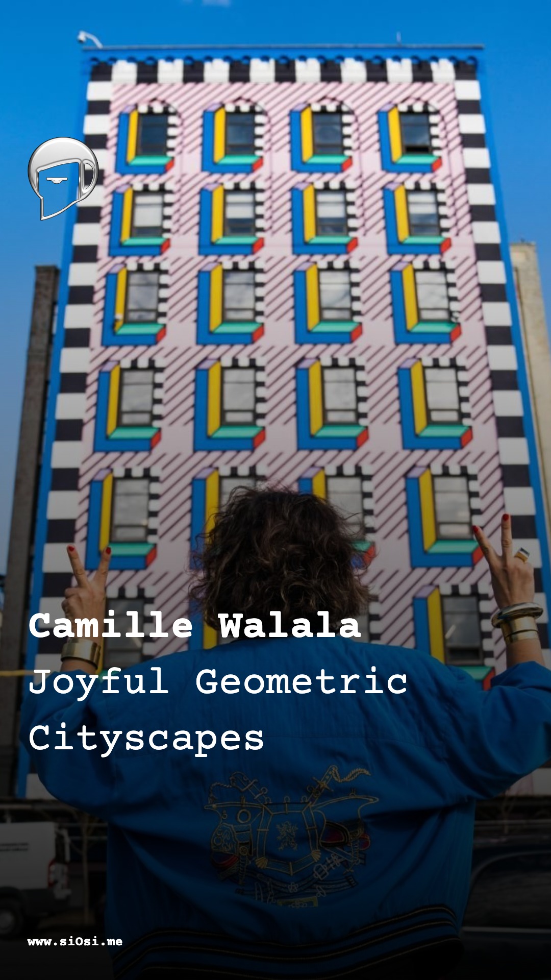
On this day in 1975 Camille Walala was born, and her bold vision has since transformed urban walls into living textiles of electric turquoise, hot pink and lemon yellow. siOsi embraces her tribal pop spirit where sharp rectangles, zigzags and chevrons wrap buildings like graphic garments, turning everyday streets into sources of optimism and play. Her high-contrast palettes and rhythmic lines invite movement and smiles, proving beauty belongs to everyone who passes by. At siOsi we channel this same chromatic joy into style that feels alive, generous and unapologetically bright.
Camille Walala’s work has given contemporary urban life a new chromatic temperature, a different pulse of pattern and light, turning streets into exuberant textiles and architecture into bodies dressed in vivid geometric skin.
Her practice is often described as “tribal pop”: a vocabulary of saturated colour, bold graphic lines, and monumental pattern that sits somewhere between Memphis Group postmodernism, Ndebele house painting, 1980s club graphics, and children’s building blocks. The result is an aesthetic that feels at once playful and disciplined, ecstatic yet carefully composed, like a city that has momentarily decided to wear its most joyous clothes.
Signature visual language
Walala’s signature language is geometric, architectural, and almost tactile in its intensity.
-
Colour Her projects work in high-key palettes: electric turquoise, safety orange, hot pink, lemon yellow, Klein blue, deep black and crisp white. Colour blocks are laid out in sharp, contiguous fields, often in contrast pairs – pink against cyan, black against white – that amplify one another and create the sensation of the building vibrating slightly in one’s peripheral vision. There is rarely a midpoint or a gentle gradient: she prefers the emotional clarity of solid colour, a flat tint that reads like poster paint on a monumental scale.
-
Line and shape Her murals and façades are built from rectangles, triangles, circles, zigzags, grids and chevrons, arranged in rhythmic bands around windows and doors. Horizontal stripes wrap corners like graphic textiles, vertical bars stretch a façade upward, diagonals slice through the composition, introducing a sense of tilt and movement. Black outlines function almost like tailoring seams: they bind colour blocks together, articulate edges, and give each shape a crisp presence against the surrounding city. The effect is close to a drawing expanded to architectural scale, a felt-tip sketch translated into masonry and concrete.
-
Scale and silhouette Walala is known for life-size murals and installations, often enveloping entire buildings or interiors. The silhouette of the architecture remains, but its visual mass changes: a once anonymous office block becomes a stacked composition of chromatic bands, a supermarket is transformed into an immersive colour-field where shelves and aisles dissolve into pattern. By exaggerating verticals and horizontals and framing architectural elements with contrast stripes, she subtly alters how the building’s proportions are perceived. Windows feel like eyes in a painted mask, corners like the folded edges of a garment.
-
Texture and material presence Although much of her work is painted, it reads texturally. Matte paint against brick or concrete produces a sensuous friction: one can almost feel the grain of the wall under the colour. Indoors, printed vinyl, textiles and objects extend the vocabulary into three dimensions, allowing pattern to wrap furniture and floors like fabric. The visual texture often derives from repetition – grids of rectangles, sequences of stripes – a kind of optical weaving that evokes textile design, reflecting her training in fabrics and surface pattern.
-
Light, contrast and movement Because she tends to work on flat architectural surfaces, light falls across her compositions with a blunt honesty. Sunlight sharpens the contrast between black and colour, shadows from balconies and street furniture introduce new graphic elements that she anticipates and uses. Movement enters through human bodies. Pedestrians crossing her murals become unwitting figures in the composition, their clothing either clashing or harmonising with the palette around them. Buses and cars slide through her painted streets like mobile colour swatches. The eye tracks stripes and diagonals, giving the viewer a brief sense of acceleration or suspension, as if the building were caught mid-dance.
Emotional presence and attitude toward beauty
At the heart of Walala’s practice is a declared ambition: to bring joy, playfulness and optimism into everyday life. Her murals are often described as “bringing smiles to people’s faces” and “reenchanting the city”, transforming drab buildings into sources of invigorating optimism.
-
Joy as urban beauty Walala treats colour as a public resource, something cities owe to their inhabitants. Beauty, in her work, is not luxury but an everyday entitlement: the right to walk past a façade that delights rather than suppresses. She identifies the monotony of grey, utilitarian architecture as emotionally flattening, and responds with chromatic excess: blocks of pattern that feel like laughter breaking into a sombre conversation.
-
Play without frivolity Critics often describe her approach as “serious fun”. The compositions may look spontaneous and childlike, but they rest on careful planning, harmonious palettes, and a strong structural sense. This gives her aesthetic a particular emotional timbre: playful, but not chaotic, exuberant yet contained. Beauty here is an alignment of impulse and order, a choreography of colour that invites spectators to relax but also to pay attention.
-
Body and space Walala’s work stages an encounter between the human body and the built environment. Murals are placed where people walk, wait, commute, shop. The scale envelops the viewer, making it impossible to see everything at once. This encourages a bodily curiosity: one has to move, turn, step back, approach, in order to grasp the composition. In this sense her aesthetic honours the body as an active sensor, assuming that beauty happens through motion, not static contemplation.
-
Optimism in a anxious era Writers have observed that Walala’s practice emerges in a time “desperate for colour and life”, suggesting her work meets a deeper cultural need for reassurance and joy amid political and environmental anxiety. Her murals do not deny difficulty; instead, they offer momentary relief, a microclimate of brightness that asserts that delight is still possible. The emotional presence is therefore not merely cheerful, but gently defiant.
Influence on fashion, beauty, and style
Although Walala operates primarily in art, architecture and interiors, her visual language seeps naturally into fashion and beauty, both conceptually and materially.
-
Graphic wardrobe and urban dressing The way she dresses buildings echoes contemporary apparel: colour-blocked parkas, patterned trainers, graphic knitwear. Her façades might be read as enormous garments thrown over architecture, a kind of street-scale styling. This resonance strengthens the idea that the city itself can be “styled”, that public space might adopt the same boldness of pattern and palette that fashion has embraced since the 1980s. Her influence lies less in single garments than in a general permission she gives to use strong graphics and saturated colour in everyday style.
-
Post-Memphis sensibility Walala’s debt to Memphis Group aesthetics – bright plastics, geometric motifs, irreverent collision of colours – places her within a lineage that has already shaped fashion prints, accessories, and editorial styling. Her updating of this vocabulary, however, strips away some of Memphis’s irony and gives it a warmer, more inclusive tone. In this softened post-Memphis mood, harsh zigzags become friendly, blocks feel playful rather than confrontational, and high-contrast palettes suggest celebration rather than resistance. This nuance affects the way graphic pattern is used in fashion editorials and beauty branding: bold, but also approachable.
-
Beauty as environment rather than face Walala’s work shifts the emphasis from beauty as something worn on the body to beauty as something inhabited. The “makeup” is on the building; the “hair” is the skyline modulated by painted geometry. This has implications for contemporary aesthetics, where wellness and beauty increasingly include surroundings. A vivid façade or patterned interior becomes part of one’s personal style narrative, an extension of the self without centering the face or figure.
-
Movement and social choreography Her large installations – such as the painted building at Industry City in Brooklyn or immersive interiors and pop-up spaces – function like public stages. People photograph themselves against her patterns, their clothing interacting with the colours behind them. While this is a social phenomenon rather than a formal fashion collaboration, it subtly trains the eye to consider pattern relationships between garment and environment. Over time, this encourages bolder pairings: stripes against stripes, clashing primaries, unexpected harmonies, a willingness to dress in ways that can stand up to a visually demanding backdrop.
Contemporary emotional “glow”
Viewed today, Camille Walala’s work still feels distinctly alive, as if each mural were breathing colour into its surroundings.
- Her surfaces emit a kind of graphic warmth, not soft or pastel, but radiant and unapologetic.
- The rhythms of stripes and blocks feel like heartbeat and pulse, an architectural cardiogram overlaying concrete.
- The strong blacks, instead of weighing the compositions down, act like eyeliner on a face: intensifying the gaze, sharpening the contours of the colours they hold.
The emotional glow is therefore a blend of joy, alertness, and ease. One is invited to drop one’s guard, but also to wake up to the possibilities of the street. In an era that can feel visually overloaded, her clarity of shape and colour offers a paradoxical calm: complexity distilled into pattern, noise translated into rhythm.
Her murals do not linger as nostalgic artifacts; they continue to feel current, especially in a culture increasingly aware of the psychological effect of colour and the importance of convivial public spaces. Walala’s work proposes that beauty might be loud yet generous, graphic yet kind – a second skin for the city, cut and coloured to lift the spirit every time the eye passes by.